Defining the Question
Can we use linear models in order to predict police shootings in the US?
Exploring the Question
Nationwide, the eyes of the public have turned towards the police with ever increasing scrutiny and questions regarding police violence. This is particularly important to examine as it relates to fatalities, particularly among minorities. Its important to understand the context of these actions and look at them with as much objectivity as one can. These are sensetive topics in the best of times, and we are far from the best of times.
The Data
Criminal data was difficult to find. I found a few government sites that listed some measure of datasets, but often they were ‘clunky’. However, I did find that the Washington Post had an excellent dataset regarding fatal shootings where an officer killed a suspect. Because the focus of this data is so specific, it’s difficult to ask more than a few very specific questions with it. Namely, we can’t explore the number of police interactions or prosecutions as it relates to this data. Towards that end, I ask the viewers to be objective in their interpretation of the data. There are many questions that I would like to ask, but can’t with this data, so we will keep our focus limited.
The raw data can be found here
My notebook evaluating and training my models can be found here
Shaping the Data
This data was already exceptionally clean. While there were many NaN values, most relevant data was present. I had several attempts at engineering new features, but each attempt gave me a great deal of data leakage. It gave me some different ideas for where to take things, but at the end of the day, all of my models performed better without much wrangling. The NaN values were manually imputed to maintain the integrity of the data, but then I structured an encoder and ran it through a few models.
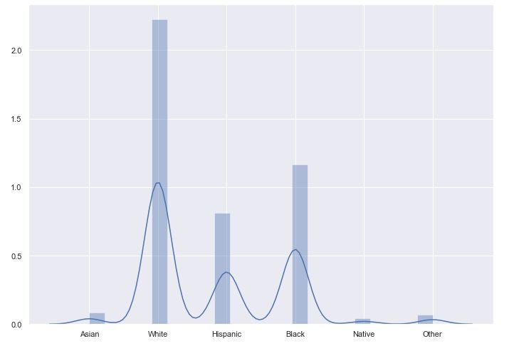
Before we get too far into that, I want to talk about the data a moment. Removing NaN values for listed race, we have 4890 shooting incidents. 50.57% are white victims, whereas (nation wide) they represent 60.4% of the population. 26.5% are black, contrasted with a national representation of 13.4%, and hispanics murders are 18.4% to a population of 18.3%. We’re already seeing some behavior bias. The only other point I would like to make with this data is that only about 51% of these victims were armed with lethal force themselves.
I picked two models to do my primary explorations with. The first was a straight forward Logistic Regression. I had some mixed success with Randon Forests, but I ended up going with XGBClassifier for my tree model selection. These performed more or less equally well with the data I provided. Logistic Regression yielded a 53.2% validation accuracy, which is about 3% above baseline. XGB had a slightly higher accuracy of 54.4% validation, so this is the model that I performed my final test on, which yielded a 54.2%, about 4% better than baseline.
Explaining the Data
I found that it was a bit easier to grasp the data if we took it in slices. I started with a distribution plot of the target spread about across their relative values. It did help draw the eye and visualize the data better.
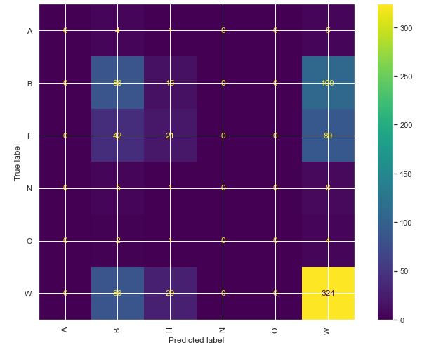
Given the overall inaccuracy of the models, I generated a confusion matrix from the logistical model, and it shows that it only had much success in guessing white or black, which are the two most prevelant points in the data. Overall, a less than stellar performance.
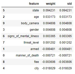
For the rest of these visualizations, I will focus on the XGB model. One of the things that we covered briefly this unit was the permutation importance. I found this to be vastly more informative than our previous horizontal bar graphs. Not surprisingly, the data reveals that the state that the shooting takes place in is the most instructive to the race of the victim. For the middle of the country, or states like Maine that have a vast racial disparity, this is more or less to be expected. For coastal cities, or those with more robust diversity, the data is a little more telling.
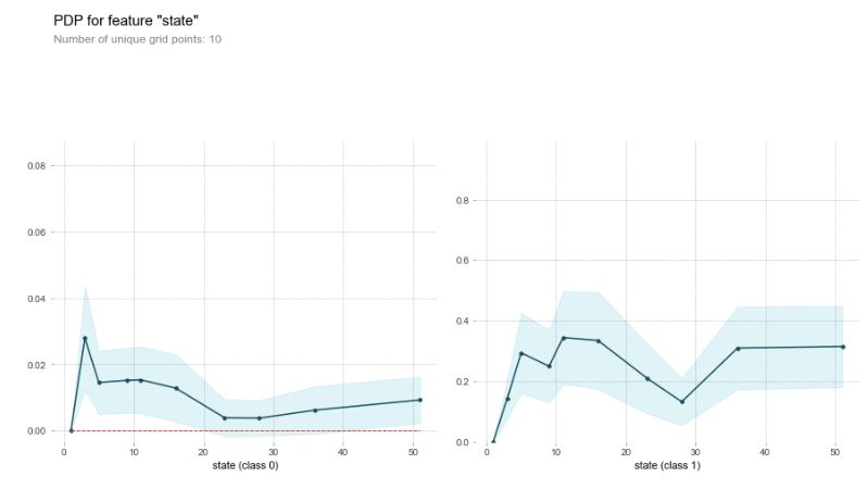
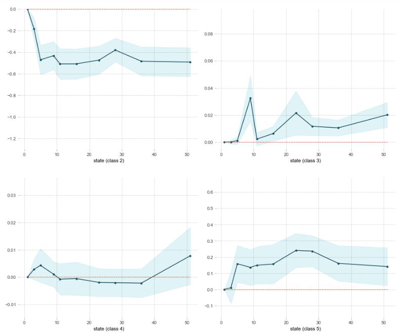
Using the permutation importances, I was able to focus in a bit a one-feature Partial Dependence Plot. For these graphs, Class 0 is Asian, White is 1, Hispanic is 2, Black is 3, Native is 4, and ‘Other’ is 5. Class 1 and 3 are the two classes that have a high divergence from national, so lets focus on those.
Notice the relationship between Class 1 and 3. The encoded turned the various states into numbers along the line, but I want to draw the eye to one state and its relationship. State 9 is Washington, where I live. Notice the drop in relation between Class 1 and 3 in Washington? And notice the sizeable spike for Class 3? This was an unsettling revelation.
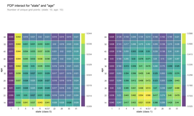
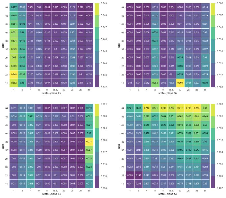
I then ran a two feature Partial Dependence plot between age and state, which had the two highest weights in our permutation importances. Both of these features have a high degree of cardinality, given that age is on a range of more or less 10-100, and states have a unique value for each state (plus Washington D.C.). Classes 0, 1 and 5 seem to have the highest interaction between age and state. It seems the general trend is for class 1 and 3 to be shot at a younger age generally, and the rest to be shot at older ages.
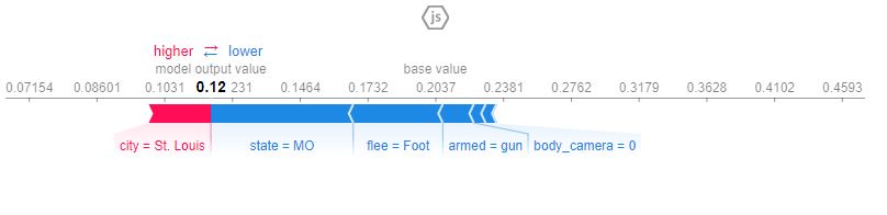
The last visualization I generated was the Shapley Values. I selected a row at random from the test set and found the variables that mattered the most. I want to point out a few things here. The data overwhelmingly has Body Cameras to 0 (meaning, they were off or not worn), so it has virtually no impact on any data. Though, the fact that the vast majority of these shooting have this column absent tells me that this is a real-life solution to some of the issues with violence.
Conclusion
This is a topic that ended up being a bit darker than I had hoped, and it was difficult to keep real life thoughts out of the data. Why are so few of these rated positive for body camera footage? Why are the shootings so high in general? Why are Black deaths so much higher than their national average for population distribution? The data can’t really answer these questions, just point out that they should be asked. Regardless, it leaves me with a bitter taste and some harsh wonderings to review.
The models that I selected both beat the baseline, but there is some static on them. I looked into engineering new features; I scrapped demographic information and build that into the datasets, but from a hindsight perspective, it leaked into the data quite a bit. Even with a wide variety of racial differences (New Mexico, Maine, and Alabama all have vastly different demographics), the models were quickly able to draw the similarities and predict with a 95% accuracy. I didn’t care for that. Removing those elements caused there to be a more true model. I also tried to peel off some of the existing features for the noise they created, but it resulted in more or less the same accuracy.
All and all, these models were not terribly helpful.
These findings are also available in a more pleasing web app found: here