Defining the Question
What is the best way to hold policing organizations responsible for what they do? What is the best way to keep the public informed of these actions? More now than ever in American history, we have a spotlight on police over-reach and a rising sense of disquiet from the general public.
The Organization
One of the leaders fighting for transparency is Human Rights First. This organization has been around for nearly 40 years fighting for equality and fair treatment under the law. They have an extensive history in defending minorities, combating torture, and ensuring consistent respect for human rights. They are a non-profit, nonpartisan international human rights organization primarily based out of New York, Washington D.C., Houston and Los Angeles.
Their Chief Technology Officer approached my team to workshop a solution to a lack of transparency on these topics.
More information can be found on this fine organization on their website, located below. Human Rights First
Understanding the Problem
On its surface, this seems like a straightforward problem. The reality is anything but. The laws that dictate how a policing organization self-report can vary wildly from County to County and State to State. The FBI has formed a group dedicated to monitoring police use of force, but unfortunately, they don’t have the legislation in place to demand compliance. They are only allowed to ask the various police organization to participate in their metrics, and only around 50% of them have elected to join.
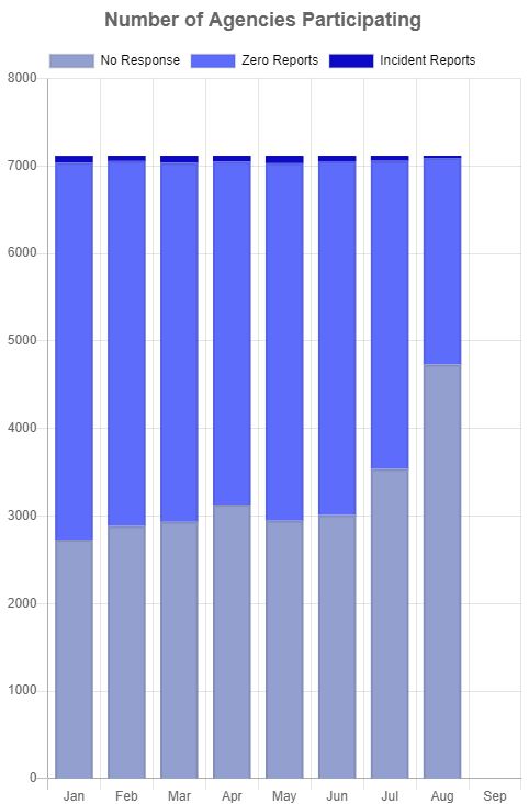
More information can be found here: FBI Use of Force Collection
In the absence of any effective government oversight on this troubling descent into a police state, we the people need to report and hold these organizations accountable. Getting this information is tricky in the best of times. Various news outlets and watchdog groups do what they can to keep tabs and report, but it simply isn’t enough, and it is too scattered. It is difficult to sort through, and hard to grab a snap-shot of these incidents.
The problem that we struggled with throughout this project was lack of data or transparency. Until we have a central voice of truth on this matter, we are largely forced to engage social media to find details about these things. Often times these can be from primary sources, but social media also opens us up to falsely generated news or re-tweets that are months old.
Our Solution
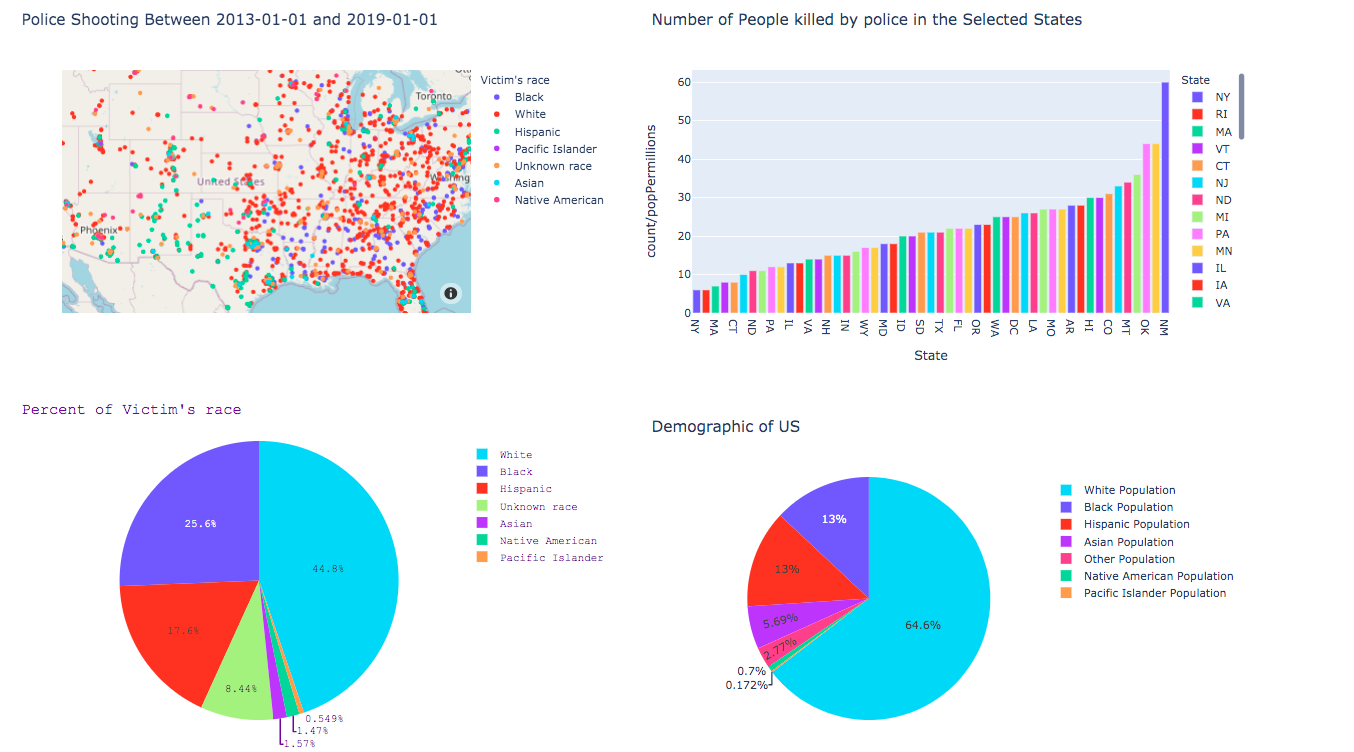
Using a variety of sources, ranging from the Washington Post, to the police brutality tags in Twitter and Reddit, we built a robust pipeline of data through which we could generate clear visualizations and some interactive graphs.
The goal here is to have a single location that draws from multiple sources and compiles these sources in a logical manner. The graphs are interactive, and a range of filters give end users many options on how best to engage. We were able to find a good deal of historical data on lethal police encounters, but there was much less accurate reports of less than lethal police encounters. Tear gas, presence, tasering (which don’t lead to shooting) and other forms of chemical force are less well tracked. For this we turned to social media, specifically the Sub-Reddit regarding police brutality, and some Twitter stories. These are easy to access using the 2020PB API.
Concerns and Fears To Overcome
Outside of this project, I had concerns regarding the wealth of data that we could find. I had written a police-shootings app a few months back, and so this was not a new struggle for me. The complete lack of transparency is extremely troubling. The social ramifications are also difficult to fully ‘grok’. As a majority class person, it is difficult to truly understand the minority experience, and projects like these run the risk of being tone deaf.
For the project itself, I had some concerns with working with a different devotion of programming, as well as a few of the elements necessary to properly execute our vision. Docker, AWS, and database architecture chief among them. These were technologies I learned a few months ago, so I was worried about being a bit rusty. Docker had been a challenge to implement correctly with the virtual machine memory, but once WSL2 was properly running, everything else was fine. AWS is also an extremely user-friendly product for Elastic Beanstalk and RDS, so these were pleasant surprises.
As far as my concerns regarding working with the team, it was mostly surrounded by not knowing the other actors involved. Fortunately, I was very familiar with my partner on the Data Science side. All of these problems were made better by engaging them. The team was immediately less intimidating after our first meeting. My concerns as they pertained to Docker or AWS were resolved by reading documentation and working through various help files. The only real concern that persisted beyond the first few days was data sourcing. There just isn’t much out there.
The Product Roadmap
We began this project by having a meeting with the stakeholder to see what some expectations were and what previous groups had difficulty with. Our stakeholder was extremely knowledgable on these topics, and as a data scientist himself, he was very familiar with the problems that we were facing. Taking his expectations to mind, we then fell back into our groups to discuss further.
We generated a Trello board and began to populate it with user-stories, most of which were taken directly from the stakeholder’s vision. These cards were then fleshed out with a checklist of necessary steps that each would require before they could be considered finished. The various teams were assigned to the tiles, and for those who felt particular inspiration, individuals were joined as well. Trello has proven to be an immense resource, not just with this project, but many of the side projects I have worked on in recent years.
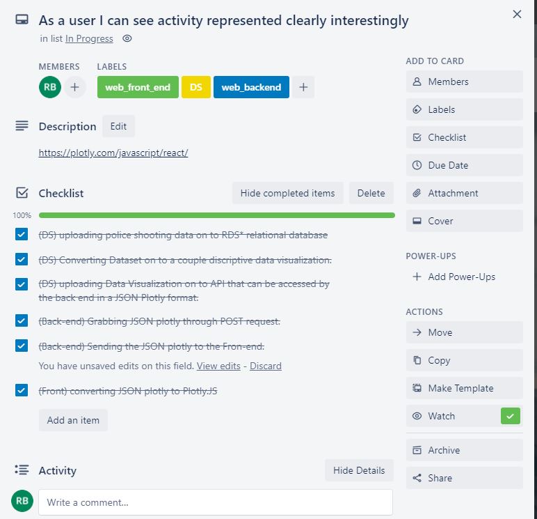
The above Trello card is the meat of the project. It involves all of the teams and requires other tasks to be done. It tracks the proper chain of custody on the data as its delivered to the end user. In the description we put a helpful link to help Front-End learn about the technology we were going to use to execute this task. And below we had space to keep each other updated when various tasks were completed as well as moving the tile along through the process.
Once we had our vision, expectations, and list of user-stories populated, we built a wire frame to outline the architecture of this project. The frame itself is fairly expansive, but I have included the Data Science team’s frame. Note that all of this was done before any actual coding took place, or before we began searching for primary sources for our models. Not all of these elements made it into final production.
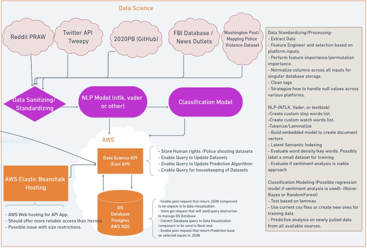
The above details the work-flow for the Data Science team, along with all of the potential aspects of the project that we might be able to develop. Some elements we didn’t have time for, or we didn’t find proper sourcing for (such is the case for the FBI database), others didn’t prove fruitful such as the NLP model. The majority of these bullpoints were utilized in our product, however, and they are factual for this framework. This proved an excellent reference tool for all of the various teams. It was most utilized by the Backend Developer, which is where you can see the line going off camera.
Technical Challenges and Specific Contributions
The breadth of this project is actually quite large. In order to get even the most basic of user-stories completed, from a Data Science perspective, we had to dig deep for data. As was stated previously, this was where a considerable amount of time was spent. We evaluated the Twitter API via Tweepy as well as the Reddit API via PRAW. We consulted various datasets on Kaggle as well as some news outlet sources like the Washington Post. Due to time constraints, we wired into the 2020 Police Brutality API and collected data on police shootings from the MappingViolence dataset (which is rooted in the Washington Post material, but is fortified with data regarding off-duty officer incidents, which were higher than I am comfortable with).
The Data Science team was primarily responsible for wiring into specific APIs to draw new data. That data was shaped, cleaned a bit, and stored separately. We then created an API that provided numerous interactive visualizations for the Back-End Developer to wire into so the Front End could access them easily. A specific example of this is here:
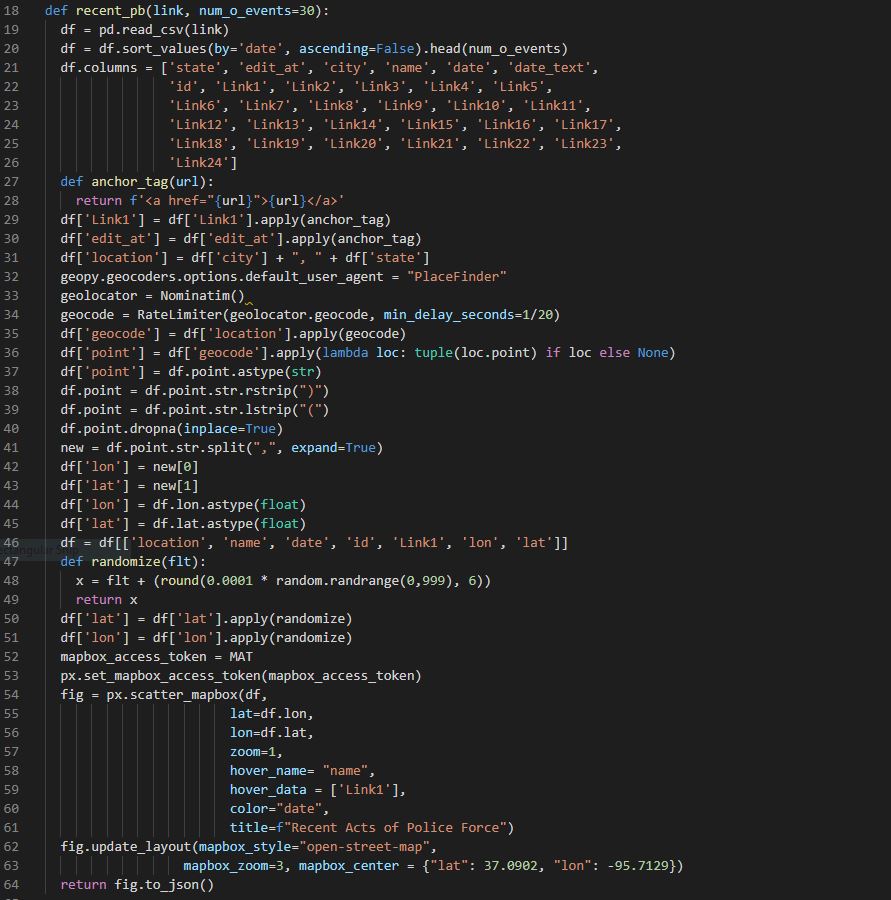
This function connects directly to the 2020PB API which is updated regularly. For our purposes, we don’t need multiple instances of the same report, so we shape the data using Pandas into something more manageable. Because we wanted the data within Link1 to be ‘clickable’, we had to apply some anchor tags, which we did using a function within the function. This was a simple process, but made a big difference on end user experience.
The longest part of this function is applying geocoding. For this we used Nominatim and RateLimiter from the Geopy library. This required some shaping of the location data, as well as removing some uniform characters from the datapoints. After that, we put it into a graph with zoom, visible metrics, and clickable links. This is where we came across a rather major problem. Because the data that we had regarding each incident was limited to the city and state, as opposed to direct latitude/longitude addresses, incidents that happened within the same given time window in the same city simply stacked one atop the other. This meant that only the top incident was being viewed, which would give a user a misleading understanding of a given city’s activity. We uncovered this error when looking at the data for Los Angeles, which had several instances but seemed to only show one no matter how far we zoomed in.
To correct this problem, we imported the Random library and wrote another function within the function. The randomize function effectively kept the first 4 digits of the latitude and longitude intact, while shifting around the next 3-4 digits. This created a small variance in the individual incidents without moving them outside of the city limits. It was a clever, low cost solution.
The final aspect of this function was to package the visualization into a JSON format for front end utilization. Using the FastAPI scaffolding, we were able to easily create numerous POST and GET requests for the various images that we had created for Back-End to wire into.
Problems With the Rest of the Team
The Web team had several setbacks that rocked the team early on, including the loss of a team member to a family emergency. Added to that, they were using Ploty, this was a new technology for them which generated some obstacles with deployment. We worked extensively with the Back-End developer to ensure that things went smoothly for the things that we could control. There were numerous little tweaks to make so that the visuals were more appealing, or the code more seamless. In fact, the above code was generated at the request of the Back End to honor the stakeholder’s desire to have a more varied incident report.
The Back End clarified what they wanted to deliver to Front End, while translating the Front End technology so that we could understand it. We built some framework to wire into the API, and were able to pull a whole new set of metrics (in this case, non-lethal police use of force). We also pair-programmed a variety of minor problems, typically debugging code or looking things up so that the Back-End was able to work seamlessly.
The Project As of Now
As the team steps back from this project, we are fully aware that it is still ‘in progress’. While the graphs and mapping are largely functional as we coded them, they aren’t seamless. Due to time constraints, our data limitations are still fairly severe, and we didn’t deploy a Machine Learning model (though we did build out one). Also, the front end wasn’t able to fully deploy the filters, so about 60% of end user options are unavailable at this time. Still, all the APIs are functioning correctly, as well as the appropriate data being displayed.
The Future of the Project
While there are some avenues for this project to explore, there are not that many easy options remaining. More work could be done to wire directly into the Twitter API and draw from their raw data. Unfortunately, there are limitations to how much data Twitter will allow, and trending stories can have thousands of tweets. This will necessitate extensive data cleaning, a primary database, and more NLP to be done to draw out hashtags and story integrity. Our preliminary efforts into this field came with lackluster results, even with a powerful library like NLTK. I think if our focus had been purely Twitter and we had more time, we could have made headway here. For now, there are simply too many users and stories to manually sort through.
Another direction to go might be allowing users to report incidents themselves the way other APIs have allowed, like the 2020PB website. Some functionality could be added to the website that might allow a user to save specific stories, or search specific states over time, which we didn’t get a chance to implement. Pulling in more story data is also an option, which might have allowed for searching based on keywords like proper names or tear-gas.
Final Reflections
This was a challenging project. From start to finish, it felt like we just didn’t have enough time to really explore the space. However, with those challenges came great learning opportunities. We were able to take real-time feedback from the stakeholder to add features, and an open pipeline with the team really gave us some agility in responding to the rest of the team’s needs. When the Back-End developer asked for a new endpoint, he was able to articulate it well and gave us the room to provide it. All issues were tackled promptly and thoroughly.
These sorts of projects are also excellent examples of real-world problems using real-world data. Finding and vetting sources, and then understanding the limitations of that data were key to delivering a viable end product. While there is still a national conversation on this topic, it is of critical importance to have as many eyes on the problem as possible. Struggling to find more information will hopefully lead to greater transparency and cooperation between the various police organizations. Its more than just numbers in a matrix; these are peoples lives and examples of a troubling trend towards authoritarian governance.